Layouts with Bootstrap
The following document is intended to give you a very simple overview of how to use Bootstrap's grid system. Everything here has been taken from the official Bootstrap documentation, and edited for brevity. Refer to the official documentation for full depth coverage. Let's begin!
What's a "Grid System"?
Grid systems provide developers with a row and column structure that can be used to arrange, align, and size HTML elements and content. Grid systems are built using CSS, and are a core feature of many different front-end frameworks in addition to Bootstrap. Bootstrap's grid system helps make creating responsive layouts very easy since the responsive CSS is built for you.
Other popular front-end frameworks that use Grid Systems:
- Semantic UI
- Foundation
- Skeleton
- Materialize
- ...and many, many more.
It is important to note that "Grid System" libraries and frameworks are NOT the same thing as native CSS3 Grid!
Creating Page Layouts Using Bootstrap
To use Bootstrap's grid system, you'll need to add pre-defined CSS classes to your HTML elements, and there are some Bootstrap-specific HTML structural conventions that must be followed.
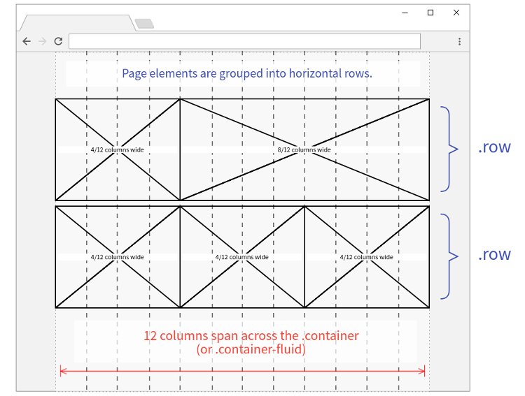
Bootstrap requires that you nest your HTML elements in a container -> row -> column structure.
Containers house rows, and rows contain up to 12 columns
<div class="container">
  <div class="row">
    <!-- COLUMNS GO HERE -->
  </div>
</div>
Figure 1. Bootstrap's container and row HTML structure.
Containers
Containers provide the outer structure that houses the grid rows and columns. You can make any <div> a container by giving it a container class. There are two kinds of Bootstrap container classes that you can use: container and container-fluid.
- The
.containerclass gives you a centered, fixed-width column with some margin on the left and right. - The
.container-fluidclass will span the full width of the browser window, with only a small amount of padding on the left and right.
TL; DR: Containers provide a means to center your site's contents. Use .container for fixed width or .container-fluid for full width.
Rows
Rows are horizontal groups of columns. A container can house many rows. A row can house up to 12 columns. To create a row, apply the class of row to any <div>. Remember that rows must be placed inside a container.
Breakpoints
Bootstrap is designed to be fully responsive and "mobile-first". This functionality is CSS driven and uses @media queries to create a handful of screen "breakpoints" based on viewport width. It's important to understand these breakpoints before using columns.
There are 5 screen breakpoints in Bootstrap:
- xs (<576px)
- sm (576px - 767px)
- md (768px - 991px)
- lg (992px - 1199px)
- xl (>1200px)
Note the 2 letter abbreviation for each breakpoint. You will need to know them for creating grid columns.
Columns
Your page content should be placed inside columns. Columns are used to size and align your page content within the grid. You create a column by adding a column class to any <div>. Remember that columns must be placed inside rows.
Column class options and syntax:
col - creates an auto sized column on all breakpoints
col-{size} - creates a column with a specific width span from 1-12
col-{breakpoint} - creates an auto sized column on a certain breakpoint on up
col-{breakpoint}-{size} - creates a column with a specific width span on a certain breakpoint on upAdding {breakpoint} and/or {size} is optional.
Auto Sized Columns
Simple columns distribute themselves evenly inside a row on all breakpoints.

<div class="row">
  <div class="col"></div>
  <div class="col"></div>
  <div class="col"></div>
</div>
Figure 2. Three columns inside a row. These columns expand evenly across the row.
Columns With Size Added
Column size is a number from 1 - 12. Rows are divided into 12 columns. The size you set on a column class will set a width out of the 12 row columns.
The pixel width of the columns are not "hard set" - they are proportional. This makes the columns flexible. Try adjusting the browser size to see this in action.
For example, a div with a class of col-6 will be 6 out of 12 columns wide, or 50% of the row width. A class of col-3 will be 3 out of 12 row columns wide, or 25% of the row width. See the examples below.
Auto Sizing: col-auto will be sized according to the natural width of the content..col-1.col-1.col-1.col-1.col-1.col-1.col-1.col-1.col-1.col-1.col-1.col-1.col-2.col-4.col-6
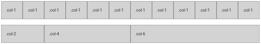
<div class="row">
  <div class="col-1"></div>
  <div class="col-1"></div>
  <div class="col-1"></div>
  <div class="col-1"></div>
  <div class="col-1"></div>
  <div class="col-1"></div>
  <div class="col-1"></div>
  <div class="col-1"></div>
  <div class="col-1"></div>
  <div class="col-1"></div>
  <div class="col-1"></div>
  <div class="col-1"></div>
</div>

<div class="row">
  <div class="col-2"></div>
  <div class="col-4"></div>
  <div class="col-6"></div>
</div>
Figure 3. Rows and columns with different sizes. These columns will be sized accordingly across ALL breakpoints.
Columns With Breakpoint Added
Remember that Bootstrap is mobile-first, and the responsive behavior is applied from small screens on up. When you add a breakpoint to a column class, the columns will expand evenly on the breakpoint that you specify. On screen sizes smaller than the breakpoint, the columns will stack full width.
For example, in the figure below the columns will be laid out evenly across the row on lg screens on up (≥992px). On screens smaller than 992px, the columns will stack in order, and be full width..col-lg.col-lg.col-lg.col-lg

<div class="row">
  <div class="col-lg"></div>
  <div class="col-lg"></div>
  <div class="col-lg"></div>
  <div class="col-lg"></div>
</div>
Figure 4. These four columns will only be applied on lg screens on up (≥992px). On xs, sm, and md screens these columns will automatically stack at full width.
Columns With Breakpoint & Size
Columns can have both a breakpoint AND a size specified. This sets a specific column size on a specific screen breakpoint. On screens smaller than the breakpoint the columns will stack full width..col-lg-3.col-lg-6.col-lg-3

<div class="row">
  <div class="col-lg-3"></div>
  <div class="col-lg-6"></div>
  <div class="col-lg-3"></div>
</div>
Figure 5. These three columns will only be laid out and sized accordingly on lg screens on up (≥992px). On xs, sm, and md screens these columns will stack at full width.
Visualizing the Grid
Additional Grid Class Options
The above examples are only the beginning! After you are comfortable creating basic rows and columns of content, explore the official Bootstrap documentation for more advanced grid options, such as:
- Using more than one column class at a time for a very flexible layout that changes on different screen sizes.
- Vertically and horizontally align columns.
- Reordering and offsetting columns in a row.
- Nesting rows and columns.
Styling & Utility Classes
Bootstrap features an extensive set of pre-defined classes for styling UI elements, such as:
- Tables
- Text & Typography
- Images & Figures
- Forms
- Alerts
- Buttons
- Borders
- Media Objects/Embeds (YouTube, Vimeo, etc.)
- ...and many more.
Bootstrap's built-in utility classes make it easy to make adjustments to your content and HTML elements without having to write the CSS yourself.
UI Components
Bootstrap features unique, reusable User Interface Components that can help you put together a front end rapidly. The UI Components combine HTML structure, predefined CSS classes, and Bootstrap's JavaScript.
- Navbars & Navigation Links
- Cards - a multipurpose content display container
- Modal/Popup Windows
- Form Input Addons
- Collapse
- Image Slideshow/Carousel
- Tooltips & Popovers
- ...and more.
Additional Resources & Tools
If you're moving from Bootstrap 4 to version 5, here's a handy guide on Migration.