Intro to Web Design
What Makes for Good Design?
"UI design is much more than just fitting together puzzle pieces of a layout. To design an interface is to create function from form, to create structure while simplifying, and to illuminate while delighting.
"The tricky part is that people will know within a couple of seconds whether or not they will stay on your site."
UXPin
Dieter Rams: Ten Principles for Good Design
- Is innovative
- Makes a product useful.
- Is aesthetic.
- Makes a product understandable.
- Is unobtrusive.
- Is honest.
- Is long-lasting.
- Is through down to the last detail.
- Is environmentally friendly.
- Is as little design as possible.
Good design is timeless. Bad design becomes dated. For example, let's examine two modern 20th century design movements that were popular during approximately the same era (1950's - 1970's): Danish Modern vs. Brutalism. Which design philosophy has stood the test of time, and which has become hopelessly dated?
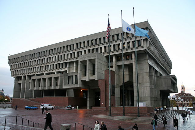
Brutalist design is characterized by the use of raw concrete. It is generally understood to be hard-edged, confrontational, and imposing.
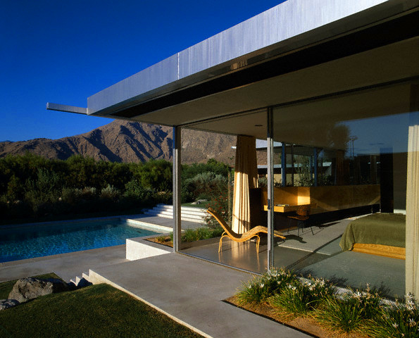
Danish Modern design is characterized by the use of open space, warm materials such as wood, and being in harmony with the surrounding environment. It is generally understood to be functional, humanistic and warm, while being distinctly modern at the same time.
Gestalt Principles in Design
Gestalt is a psychology term that refers to visual perception, and means "unified whole". It attempts to describe how people tend to organize visual elements into groups when certain principles are applied. How do variations in arrangement, perspective, size, contrast, etc. alter how people see something?
Link: The Gestalt Principles
TL; DR:
- Shapes and contours take precedence in web design.
- Similarity. Objects that look similar are perceived intuitively as being similar. Use this to communicate relationships between items. Use similarity to create good UX. The visual similarities don't have to be glaring, they can be subtle. Color, shape, size, etc.
- Contrast can highlight differences between items and can help define boundaries. Light/dark, clashing colors, warm/cool, etc.
- Closure. Our brains will automatically try to fill in the "gaps" between incomplete objects.
- Momentum. The eye will create "momentum" as it moves along a line, and from one object to another.
Layout & Negative Space
All good designers understand the importance of appropriately applied negative space. Well-utilized negative space, or "white space" can:
- Improve comprehension.
- Clarify relationships.
- Draw attention.
F-Pattern & Z-Pattern Layouts
End users generally tend to scan web pages, looking for the best or most relevant bits of information, rather than read each and every word. Consider using the F-Pattern for text-heavy sites, and the Z-Pattern for pages that are less content-heavy.
https://www.wordstream.com/blog/ws/2018/07/31/f-z-patterns-landing-page-design
Color
Color Picker Tools:
- Adobe Color CC: color.adobe.com
- Flat UI Color Picker: www.flatuicolorpicker.com/
Using the Color Wheel
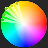
Analogous Colors are next to each other on the color wheel. These colors harmonize and can create a vibrant color palette. Be aware of the intensity of your color choices in an analogous color scheme.
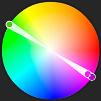
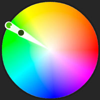
Complimentary Colors are opposite one another on the color wheel. These colors clash with, and intensify one another.
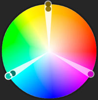
Triadic color schemes are evenly spaced around the color wheel, about 120 degrees apart. This makes for a simple, vibrant, and balanced mix. Consider letting one color be dominant, and the others be used as accents (in lighter and darker shades).
Monochrome color schemes are comprised of different shades of the same color.
Color and Psychology
While there is much conjecture and controversy regarding how people perceive color psychologically, there are a few very general conventions regarding the perception of color in branding, based upon testing of consumer responses. (Impact of Color on Marketing, Satyendra Singh, 2006.) Personal preference, context, and cultural differences have a profound effect on the perception of color in regards to a product, but here are some very generalized guidelines below:
- Red: Power, importance, youth, boldness, excitement. Attracts attention. Possibly conveys anger. YouTube. Yelp.
- Orange: Friendliness, energy, uniqueness. Amazon. Firefox.
- Yellow: Happiness, enthusiasm, antiquity (darker shades). The most energetic of colors. Sprint. AIM.
- Green: Growth, stability. Financial themes. Environmental themes. Duolingo. Evernote.
- Blue: Calm, safety, openness (lighter shades), reliability (darker shades). According to some research, blue has been found to be one of the most favored color by both men and women. With the color blue, meaning can vary greatly. Twitter. Facebook.
- Purple: Luxury, romance (lighter shades), mystery (darker shades). Wealth. Yahoo. Monster.com
- Black: Edginess, sophistication, power. Uber.
- White: Cleanliness, virtue, simplicity. Wikipedia.
- Gray: Neutrality, formality, traditional and professional. A powerful color in the right hands. Apple.
- Beige/Taupe: A "wildcard". Draws out other colors. Best used as a secondary or background color.
- Off-White/Ivory: Comfort, elegance, simplicity. slight variation on white.
Typography
Typefaces & Fonts
The terms typeface and font are often used interchangeably to refer to a particular design of type. Generally speaking, this is just fine. Technically speaking, there is a distinct difference between the two.
Typeface refers to a type design as a whole, including all of its subsets. For example, "Helvetica Neue" is a typeface.
Font refers to a particular subset of a typeface, such as "Helvetica Neue, Condensed Bold". The typeface "Helvetica Neue" is comprised of many different fonts.
Typefaces and fonts are designed for different purposes. Some are meant to be glanced at - such as ornamental text in a headline, for instance. Some typefaces, like serif and san-serif, are meant to be clearly legible for paragraph text.
Serif
Serif typefaces are characterized by the small strokes on the ends of the letters, and are designed with legibility in mind. On printed material, serif type is more legible at smaller font sizes than sans-serif type. On backlit screens, however, serif typefaces can be more difficult to read at smaller font sizes. Sometimes serif typefaces are referred to as "Roman". Old-style, Transitional, Didone/Modern, and Slab are narrower classifications of Serif typefaces, and refer to the specific look of the letter serifs themselves.
Examples of Serif typefaces are:
- Times New Roman
- Garamond
- Georgia
Sans-Serif
Sans-serif typefaces are characterized by a lack of strokes on the ends of the letters, and are also designed with legibility in mind. In print media, sans-serif type is generally reserved for headlines and not body text, as it is more legible at larger sizes. The reverse is true on digital screens however, where sans-serif typefaces are considered more legible at smaller sizes. Another term denoting sans-serif type is "Gothic".
Examples of Sans-serif typefaces are:
- Helvetica
- Futura
- Gill Sans
Monospace
Monospace type, otherwise known as fixed-width type, is a font or typeface where all the letters occupy the same amount of horizontal space. They were originally designed for use with typewriters, as the mechanism required uniform spacing for each letter. Monospace type is used today for coding, as most IDEs and text editors use them by default. This increases the readability of code as it preserves uniform spacing. In the fields of programming, science, and music, monospace fonts are used in cases where the uniformity of the output is key.
Monospace typefaces include:
- Courier New
- Lucida Console
- Consolas
Ornamental & Handwritten
These fancy typefaces are designed for decorative purposes, and are appropriate for headline text, as they are difficult to read at smaller sizes.
Ornamental typefaces include:
- Pacifico
- Zapfino
- Papyrus
TL; DR:
- The more ornamental the type, the more effort a user will need to mentally process the content.
- A typeface should accentuate the content, not compete with it.
- Keep it balanced and readable.
- Be aware of the effect of line length. Shorter lines are easier to read and comprehend at a glance. At around 70 characters in length, the cognitive load on the viewer increases.
- Words words words words words words words words words, and more words. <-- This is 70 characters, BTW.
- Line height gives your text breathing room. Experiement with this and use it to your advantage. 1.5em in line height is a nice place to start.
Beware of Lorem Ipsum
Create your design around ACTUAL content to the furthest degree possible. Ipsum placeholder text can hold your design back. The design should enhance and heighten the effect the actual content and words. Ipsum is nonsense, and is not an suitable substitution for real content.
Web Design Examples
Designs We Like:
Designs We Dislike:
Designs So Bad, They're Fun: