Intro to CSS
What is CSS?
CSS stands for Cascading Style Sheets, and CSS is the style language of the web. CSS tells the browser how HTML elements should look. Colors, backgrounds, borders, positioning of elements, etc. are all laid out via CSS rules that are included alongside your HTML code. HTML and CSS tie structure and style together.
How to add CSS to your Project
There are three ways to add CSS to your web pages:
- Inline
- Adding CSS rules directly to the
<head>tag of your HTML document, using the<style>tag. - By linking to external CSS files.
Inline CSS
Inline CSS refers to adding CSS rules directly to your HTML. (See example below.) This is considered a bad practice. Inline CSS rules are notoriously difficult to maintain across a site with many pages, and they will always override other CSS rules that are loaded from external style sheets, AND rules that may have been written in the tag. Don't do it!
<!-- don't do this!!! --><h2 style=color: red;>My Heading</h2>
Using the <style> tag.
Include a stylesheet directly to an HTML document by writing CSS rules inside a <style> tag, which is placed within the <head> tag. See example below:
<!DOCTYPE html>
<html lang="en">
  <head>
    <meta charset="utf-8" />

    <!-- CSS styles start here -->
    <style type="text/css">
      p {color: red;}
    </style>

    <title>CSS Using the Style Tag</title>
  </head>
  <body>
    <p>This is an HTML document. :P</p>
  </body>
</html>
Think carefully before employing this method since rules that are written in the <head> will override conflicting rules loaded from external style sheets. Stylesheets that are written directly in the web page documents themselves, rather than being organized in a centralized external location, can be extraordinarily difficult to maintain across a site with multiple pages.
Linking to an external style sheet.
This is the preferred way to use CSS!
<link type=text/css href=css/style.css rel=stylesheet />
The above line is the syntax we use to link to an external style sheet in the <head> tag of your HTML.
Oftentimes, you will see a web page linking to more than one CSS file. This is very common, especially when using front end frameworks such as Bootstrap. It is important to note that CSS rules are applied in order from the top down (hence the term cascading). Conflicting CSS rules in the last linked stylesheet will override rules in the style sheet above it.
Why is this better than the other ways?
Because the modern web separates content from presentation.
- Content - the writing, pictures, and multimedia that is the main focus of your site. The "steak".
- Presentation - the visual look and feel of your site. The "sizzle".
When we separate these two, it is very easy to apply the same presentation to change one without the other. This means that you can update the visual look of your site without rewriting your content, or you can drastically change the content without worrying about how it will look with your pre-existing stylesheet.
For a demonstration of what you can achieve by just switching stylesheets, check out CSS Zen Garden.
CSS Syntax
selector {
  property: value;
}
In CSS terminology, the entire line is called a rule. This rule starts with a selector. The selector targets which elements in your HTML document the rule applies to. The part inside the curly braces is the declaration. Declarations consist of a property, followed by a value. Always end each and every declaration with a semicolon!
Basic CSS Selectors
HTML elements can be targeted in a number of ways using various CSS selectors. Some selectors are more complex than others. Here we will cover the three most basic ways to select an HTML element. Consider the HTML code below:
<h2 id="subnav-title" class="panel-heading" role="menu">Panel Title</h2>
There are three basic ways we can target this text using CSS:
- By tag type, by simply typing the tag name.
h2 {color: red;} - By class name, by typing a
.(period) before the class name..panel-heading {color: red;} - By id name, by typing a
#symbol before the ID name.#subnav-title {color: red;}
Basic CSS Properties
Get to know the following CSS Properties and how to set their values:
- background
- border
- color
- height
- font-family
- font-size
- margin
- padding
- width
CSS Shorthand
Some individual CSS properties can be combined into a single rule. Shorthand properties allow you to set several values at once for the sake of conciseness, ease, and readability. For example: background-color, background-repeat, and background-image can all be declared simultaneously with the single background property.
Note: There are some tricky cases when using advanced or complicated shorthand properties. Refer to: MDN: CSS Shorthand Properties.
CSS Shorthand works with the following commonly used properties:
- margin
- padding
- background
- border
- font
- outline
- list-style
Shorthand Example: Margin & Padding
The margin and padding values can be set using a shorthand syntax, as follows:
/* margin: top, right, bottom, left */
margin: 10px 20px 5px 15px;

/* margin: top, left and right, bottom */
margin: 10px 20px 15px;

/* margin: top and bottom, left and right */
margin: 10px 15px;

/* margin: all sides */
margin: 10px;
Shorthand Example: background
You can set the following rules:
background-color: #000;
background-image: url("../img/image.gif");
background-repeat: no-repeat;
background-position: top left;
background-attachment: fixed;
...in one single line by writing the following:
background: #000 url("../img/image.jpg") no-repeat top left fixed;
Here are the default values:
background-color: transparent;
background-image: none;
background-repeat: repeat;
background-position: top left;
background-attachment: scroll;
Shorthand Example: border
Border width, style and color can all be set using the following syntax:
border: 5px solid #000;
Note: The above syntax can only support border widths that are equal on all sides. If varying border widths need to be set on different sides of an element, these must be set individually.
CSS Units & Values
There are a variety of units and values that we can use in our CSS files. Although all of the listed units and values below will work, only some are appropriate for use on the web, and browser support may vary. Check caniuse.com
Acceptable Units of Measure
px- pixelsem- Preferred. A relative unit of measure representing the font size of the parent element.rem- Preferred. A relative unit of measure representing the font size of the ROOT element (usually the <html> or <body> element).%- percentagevh,vw- 1% of the viewport height or widthch- width of the character "0" in the element's fontex- height of the letter "x" in the element's fontvmin- 1vhor 1vw, whichever is smaller.vmax- 1vhor 1vw, whichever is larger.
UNacceptable Units of Measure
Using these units for the web is generally considered bad practice.
in- inchescm- centimetersmm- millimeterspc- picaspt- points
Colors
- color name. See the X11 Color Names.
hexrgbrgbahslhsla
/* the following colors are all RED */

div {
  color: red;
  color: #ff0000;
  color: rgb(255, 0, 0);
  color: rgba(255, 0, 0, 0.5) /* 50% opacity */
  color: hsl(0, 100%, 50%);
  color: hsla(0, 100%, 50%, 0.5) /* 50% opacity */
}
CSS Box Model
To understand how elements behave in CSS, you must first understand the box model. For display purposes, every HTML element is considered to be a rectangular box, which has a content area surrounded by padding, a border, and margin. Increasing the size of these attributes will increase the size and the space an element occupies on a page.
The Default CSS Box Model
The following diagram illustrates the default box model as it applies to block elements.
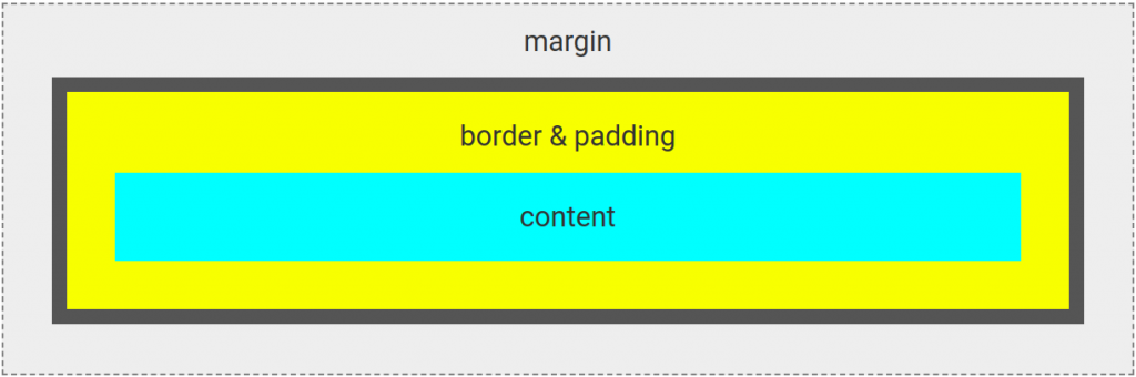
Content
The space the content occupies, without any padding, border, margin applied.
Padding
Padding creates space in between the content area and the border. Padding will take on the background color of the content or element.
Border
Represents the visible outer edge of an element. This is outside of the padding, but before the margin. The border can have a set color, pattern, or image applied to it if desired.
Margin
Transparent area outside of the content that pushes surrounding elements away. Increases the space an element occupies on the page, although it is invisible.
Box-Sizing Property
/* box-sizing: content-box; is the default */

* {
  box-sizing: border-box;
}
The above rule changes everything regarding the standard CSS box model. Border-box will change the box model by declaring that padding and border are included in the element's width and height. This means that if you declare an element to be 100px wide and 200px tall, border and padding will NOT add to this size. The added border and padding will take up the interior space of the element instead. It is important to note that Bootstrap uses border-box by default.
Block and Inline Elements
HTML elements are considered either "block" or "inline" elements.
Block elements take up the entire width of its container, creating a solid "block" of content. New block elements will start on a new line. Some block-level elements include: <p>, <div>, <h1>-<h6>, <ul> and <ol>, <table>, <header>, <footer>, etc.
Inline elements will only occupy the amount of space taken up by their content and do not start on a new line. Inline elements can only contain other inline elements. Some inline elements include: <a>, <code>, <kbd>, <strong>, <em>, <img>, <span>, <button>, <input>, <label>, etc.
Inline Elements and the Box Model
Inline elements apply the box model in a slightly different way. On inline elements, vertical padding and margins are applied, but they will not push away text or other elements away that are above or below it. Horizontal margins and padding are applied to the beginning and ending of the element only. Beware of inline elements that wrap to a second line.
To control the vertical margins and padding on inline elements, use the display: inline-block; property, or alternatively adjust the line-height instead.
Additional Reading: Mozilla.org: Understanding the Inline Box Model
Display Property
When we hover over HTML elements in Chrome DevTools, both inline and block elements are highlighted as boxes on the page. This is exactly how elements are rendered in a browser: as boxes. Setting the display property in CSS allows us to specify the type of box the browser will render a particular HTML element as.
The default display type for each element depends on several factors:
- The element type - inline or block
- If there were any other CSS rules already applied to it (like floats)
- User-agent and browser default styles.
There are many different display values that can be set for an element - but we will go over the most common right now:
display: none;
This turns OFF the display of an element - it will disappear from the page as if it didn't exist in the HTML at all. The space it would normally occupy on the page will collapse as if it didn't exist. An element with a display:none; rule applied will not be visible on the page, and neither will its children.
If you want to make the contents of an element invisible, but yet have the space it takes up to still be accounted for on the page, look at the visibility CSS property.
display: block;
This will display the element as a block element.
display: inline;
This will display the element as a inline element.
display: inline-block;
This is a hybrid of block and inline display. The element will be displayed inline along with the surrounding content as if it were an inline box, but inline-block preserves the box model margins and padding like that of block-level elements.
display: flex;
This is required on the parent element when using Flexbox layout.
display: grid;
This is required on the parent element when using CSS Grid layout.
Floats & Clear
Another way of moving elements around the page using CSS is by the float property. Float pushes an element as far as possible to the right or to the left inside it's container, and allows other elements, such as text, to wrap around it.
This is primarily used to wrap text around an image. When it comes to positioning page elements there are typically better ways of doing this than floating them.
The float property can have a value of: left, right, none, or inherit.
Clear Property
clear: both;
The clear property specifies if anything is NOT allowed to be directly next to an element. In other words: On elements with the clear: both; property, elements NOT allowed on both sides of it. The clear property applies only to block-level elements.
For Example: To "clear" a float so the rest of the content underneath will fall into place properly, place an empty <div> (or other block-level element like <br/> or <hr/>), after the floated element with a rule of clear:both; applied to it. Usually this element is given a class name of "clear" or "clearfix". This is an old and well established CSS hack, called the clearfix hack. If you plan on using floats, read up of clearfix.
Note: A class of "clearfix" is built into Bootstrap by default.
CSS Combinators
Use the following Combinators in your CSS selectors for a more flexible way to target page elements based upon relationships.
Descendant Selector
div p {color: yellow;}
The Descendant Selector is simply two selectors with a space between them. It targets all elements that are descendants of a specific element. For example, the above rule targets all <p> tags that live inside <div> tags.
Child Selector
div > p {color: green;}
Selects all <p> tags that are immediate children of <div> tags. This does not include child elements of child elements of the <div>. For example:
<div>
  <p>Yes. Paragraph 1 in the div.</p> <!-- Child -->
  <p>Yes. Paragraph 2 in the div.</p> <!-- Child -->
  <span>
    <p>No. Paragraph 3 in the div.</p> <!-- Child of span, Descendant of div -->
  </span>
</div>
Adjacent Sibling Selector
div + p {color: red;}
Selects siblings that immediately follow an element. The sibling elements must have the same parent. The above rule selects all <p> tags that are placed immediately after <div>s. For example:
<main>
  <div>
    <p>NO. Paragraph 1, child of div.</p>
    <p>NO. Paragraph 2, child of div.</p>
  </div>
  <p>YES. Paragraph 3. <strong>Immediate</strong> sibling to div.</p>
  <p>NO. Paragraph 4. Sibling to div.</p>
</main>
General Sibling Selector
div ~ p {color: blue;}
Similar to the Adjacent Sibling selector, but less strict. Selects all siblings of an element. The above rule selects all <p>s that are siblings of <div> elements.
Advanced CSS Selectors
* Selector
* {margin: 0;}
the * selects every element on the page. This selector is sometimes found in CSS resets. The * selector can also be used as a child or descendant selector. For example:
.container * {color: red;}
This will select every element that is a descendant of .container.
Attributes Selectors
The following selectors are used to target elements with a specified attribute, or attribute value. See the examples below:
a[href] {color: orange;} Targets <a> tags with an href attribute.
a[href="http://www.google.com"] {color: yellow;} Targets <a> tags with an href value of http://www.google.com.
a[href*="google"] {color: purple;} Notice the * after href. This targets <a> tags that have google somewhere in the href value.
a[href^="http"] {color: green;} Notice the ^ after href. This targets <a> tags where the href value begins with http.
a[href$=".pdf"] {color: cyan;} Notice the $ after href. This targets <a> tags where the href value ends with .pdf.
a[class~="btn"] {color: magenta;} Notice the ~ after class. This targets <a> tags where the class value is a whitespace-separated list of words, one of which is btn.
a[class|="btn"] {color: dodgerblue;} Notice the | after class. This targets <a> tags where the class value is btn, or btn followed by a "-".
Pseudo Classes
selector:pseudo-class {color: red;}
Pseudo classes can target elements by a "state" - such as whether a link has been visited, or on mouse hover. Some commonly used pseudo-classes include:
- :link
- :visited
- :hover
- :active
- :first-child
- :last-child
- :nth-child(n)
For example, the following line of code will apply an underline to <a> tags on mouse hover.
a:hover {text-decoration: underline;}
Refer to the MDN Documentation for a complete list of CSS Pseudo-classes: MDN: CSS Pseudo-classes
Pseudo Elements
selector::pseudo-element {property: value;} /* CSS3 Syntax */selector:pseudo-element {property: value;} /* for backwards compatibility */
Pseudo-element selectors are used to target a specific part of an element or document.
- ::after - Creates a virtual last-child of the selected element. It is typically used to add content using the
contentproperty. This element is inline by default. - ::before - Creates a virtual last-child of the selected element. It is typically used to add content using the
contentproperty. This element is inline by default. - ::first-letter - Selects the first letter of the first line of a block, if it is not preceded by any other content.
- ::first-line - Applies styles to the first line of an element.
- ::selection - Applies styles to content that has been highlighted by the user. (e.g. selected with the mouse or another pointing device).
Media Queries
Media queries function as filters for CSS rules. Using media queries we can limit certain styles based on the media type and device characteristics such as device width, aspect ratio, orientation, and more. This is how responsiveness is enabled based on screen size.
@media only screen and (max-width:767px) { ...CSS rules here... }
A media query consists of a media type and at least one expression. Using the syntax in the example above you can apply a set of CSS rules only if the screen width condition is met.
- @media - This begins the media query.
- only - The only keyword prevents older browsers (that do not support media queries) from automatically applying the media-specific styles inside the {}.
- screen - This targets the screen.
- and - The and keyword is used for combining multiple media features together, as well as combining media features with media types. In our example above, the and keyword combines screen with max-width.
- (...condition...) - For responsive websites, max-width and min-width are commonly used. For loading Retina specific images, min-resolution and min-device-pixel-ratio are used. (See Retina Support below.)
For example, if we wanted to apply certain CSS rules on the XS Bootstrap breakpoint, we may write the following:
@media only screen and (max-width: 767px) {
  img { float: none;}
  h1 { font-size: 1.2em;}
}
See the following links:
CSS Inheritence & Specificity
CSS I&S is probably the most challenging aspect to CSS. "Cascading". CSS I&S determines which rules are applied by the browser.
- User-Agent: The browser defaults.
- User: Styles that are specifically set by the end-user.
- Author: YOUR CSS, including those:
- loaded from external files
- in the <head> tag
- in the HTML itself (inline), God forbid!
We cannot have control over the browser defaults or the user-set styles, so we will only be focused on your Author CSS.
Style rules are read and applied by the browser from top down, hence the word "cascade". If there are two conflicting CSS rules, the one declared last will override the one above. This also refers to rules in stylesheets that are linked to and loaded last. See example below.
Example:h1 { color: blue;}h1 { color: black;}
The <h1> color will be black.
Inheritance: Refers to the way that elements can inherit styles from parent elements. A simple example: text inside a <div> will inherit the color that is set on the <body>, unless you set a more specific rule for the <div> itself.
Specificity: This determines which style rules get applied by the browser, based on how and where they are written.
Order of Specificity
After order is taken into account, there are 6 general categories of Specificity (in order from least specific to most):
- element selectors
- class selectors
- attribute selectors
- pseudo-class selectors
- ID selectors
- inline styles
If 2 conflicting rules are applied to the same HTML element, the one that is more specific wins. Inline HTML will override all else (and is a bad practice).
For example, consider the following rules:li.nav-item {color: red;}li {color: blue;}
The first rule is more specific, and will override the second rule. This is because a class selector is more specific than an element selector.