Intro to UX
What is UX & UI?
UX stands for "User Experience." UX refers to all aspects of an end-user’s interaction with your product.
"User Experience (UX) involves a person's behaviors, attitudes, and emotions about using a particular product, system or service."
("User Experience." Wikipedia, The Free Encyclopedia. Wikimedia Foundation, Inc. 3 Jan 2015. Web. 27 Jan 2015. <http://en.wikipedia.org/wiki/User_experience>)
UI stands for User Interface. UI refers to the graphical elements of your website or application that a user can see and interact with on the screen. These are elements such as buttons, form fields, navigation links, etc.
Your back-end code does have a direct influence on the UX, even though it may not directly involve the UI elements. UX is everyone’s responsibility. Everything that everyone contributes must come together into a final product.
Strategic Design
When we refer to design, we include ALL the components, features, and functionality of an application - not only the visual aesthetics, branding and graphics.
It is important to keep the project's goals in consideration during every aspect of the interface design process. You aren’t just designing something that looks good, but an interface that will help accomplish a specified set of goals. The design aesthetic and look/feel is important, but it must be cohesive with the overall goals of the product.
We will be establishing goals and purpose for our project from the beginning. Your site or app is an interface that serves a function, and it should make your users happy if it is to be successful. If you’re doing a redesign, know why the redesign is necessary. Is it just a matter of an updated look and feel, or is the goal of a redesign to increase conversion rates, sales, user participation, sign-ups, or a decrease in bounce rates?
Here are some things to keep in mind:
- Clearly identify your purpose and audience.
- Clearly outline project goals. (Business goals, end-user's goals, etc.)
- Shape and focus features, functionality, and UI design towards meeting project goals.
- Streamline and optimize features, functionality, interaction flow, and the UI as necessary.
- Test the results.
Personas, Use Cases, & Interaction Flow
Persona: A hypothetical model for a user of your product. A persona is based upon your intended target audience, or a segment thereof. This should be based on quantifiable data whenever possible.
User Story: Defined along with a persona, this is a one sentence statement of a user's overarching need or goal. As a user, I want to...
Use Case: A Use Case thoroughly describes the scenario in which a user will use your product and the specific steps needed to complete a task or goal. (See Interaction Flow below.) Comprehensive or fully dressed Use Cases will include:
- Title
- A brief high-level description of the scenario.
- Name of the actor, user, or Persona and their role.
- Usage preconditions
- Usage postconditions
- Interaction Flow(s), including alternates where appropriate.
- Frequency of Use
Interaction Flow: Generally included in a Use Case, an Interaction Flow (or User Journey) is a detailed outline of the very specific steps a user must take to accomplish a task or goal. These user-initiated steps should be paired with the corresponding system responses. Simple Interaction Flows can be described as a simple list of actions taken by the end-user and the system's responses. Complex Interaction Flows are often represented as a detailed flow chart or diagram (see IFML and UML).
Additional Reading:
Design-Minded Development, Interaction Design & User-Centered Design
This material has been adapted from: UX Booth - Complete Beginner's Guide to Interaction Design
Interaction Design (abbreviated IxD), is a subset of UX Design. User Experience refers to ALL aspects of a person's experience with a product, while Interaction Design focuses on the human-computer interaction aspect specifically.
The Interaction Design Association explains:
"Interaction designers strive to create useful and usable products and services. Following the fundamental tenets of user-centered design, the practice of interaction design is grounded in an understanding of real users - their goals, tasks, experiences, needs, and wants. Approaching design from a user-centered perspective, while endeavoring to balance users’ needs with business goals and technological capabilities, interaction designers provide solutions to complex design challenges, and define new and evolving interactive products and services."
-http://ixda.org/ixda-global/about-history/
Concepts of IxD
Goal Driven Design
Users typically have a number of goals in mind when using your website. Perhaps they want to balance their checkbook online. If so, your application should do this one thing well.
"Interface as Magic"
Alan Cooper (author of About Face 3: the Essentials of Interaction Design), says that ideally, interfaces wouldn’t exist at all in the mind of the user - they should simply "see" the interface as an extension of the underlying system. To this effect, the best interaction designs don’t exist: they don’t take a long time to load/respond; they don’t make users think; and they don’t give user’s cause for grief. As Jason Fried, CEO of 37 Signals says: "Less is Less." Give the user’s just what they need to accomplish their goals and then move along.
Usability
Usability denotes the ease with which people employ a tool in order to achieve a particular goal. So, what do you go from here in regards to IxD?
- Form/Inform a Design Strategy
- Identify and wireframe key interactions
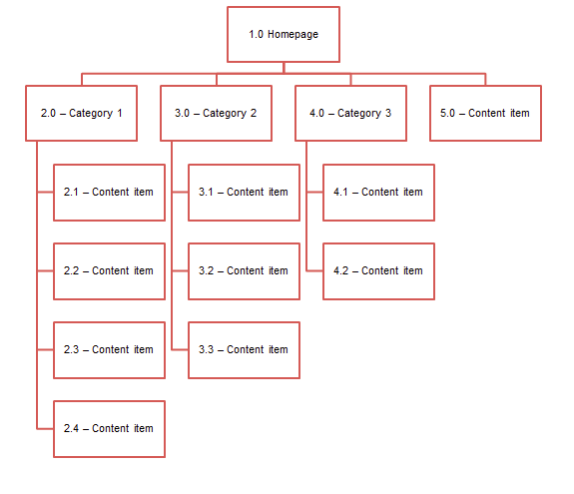
Sitemapping
A sitemap is a hierarchical structure of the website or app. It represents the taxonomy of the content. How are you going to group your content? Where should it go logically for a user? A sitemap is a reference point for the wireframe to follow.
Sitemaps are useful for the following reasons:
- They outline how navigation could/would be structured.
- They outline where the content will live, and what needs to be created.
- They show the relationship between different pages and content.
- They provide a structure upon which you can base estimates and development costs, and help you keep an eye on project scope.
- It shows you a large part of what you will be creating!
Sitemaps are generally created after the personas and use cases.
Wireframing
"Wireframing is an important step in any screen design process. It primarily allows you to define the information hierarchy of your design, making it easier for you to plan the layout according to how you want your user to process the information."
Tuts+
Wireframing is where you begin to define the UI, or user interface. A wireframe is a blueprint in black and white before designing the UI elements themselves. It maps out where the information is going to go, the hierarchy of the elements, and how the user will interact with your product. This helps you plan out the layout without getting distracted by the myriad of design choices available. Wireframing helps you plan a streamlined and efficient user interface.
"“Like the foundation of a building, it has to be fundamentally strong before you decide whether to give it an expensive coat of paint."
When is it time to create a wireframe? Wireframes are typically created after the personas, use cases, and site maps. Low-resolution wireframes can be made during the discovery and planning processes of a project. Low resolution (or low fidelity) wireframes are very loose sketches. Higher resolution (or high fidelity) wireframes are more akin to mockups, which are much more detailed and generally made as part of the visual design process.
Keep in mind that wireframes and mockups, although often used interchangably, are not the same thing.
Many ways one can create a wireframe: pen and paper, whiteboard, using online wireframing tools such as balsamiq, applications such as Axure, with Photoshop, Illustrator or other favorite graphics program.
Additional Reading:
- How to Wireframe
- Tuts+ A beginner’s Guide To Wireframing
- Designmodo: Wireframing, Prototyping, Mockuping - What’s the Difference?
Differences Between Desktop & Mobile
Mobile personas and use cases will often differ from their desktop counterpart. Sometimes a mobile and a desktop user will have different goals, even though they may be accessing the same product.
Notable Features and Constraints inherent in Mobile and Desktop Platforms:
| Desktop/Laptop | Mobile |
|---|---|
| - Large screen | - Smaller screen |
| - Keyboard & Mouse | - Finite data and battery. |
| - User is often seated with full attention on the screen. | - Divided attention |
| - Desktop users generally will have a consistent network and power supply. | - Uncertain network access |
| - "Handedness". This refers to how a user will use their hands to interact with the device screen. |
The mobile platform has more constraints. A growing trend in web development right now is taking a “mobile-first” approach to design.
Historically, websites were designed for desktop users first, then were scaled down for mobile users second. "Mobile First" means considering the needs and use case(s) of the mobile persona FIRST, then progressively scaling UP to the full desktop version second.
Mobile First Development: Graceful Degradation vs. Progressive Enhancement
Graceful Degradation: "Gracefully" scaling a product down. Removing content, features and functionality. Progressive Enhancement: "Progressively" enhancing a product. Adding content, features and functionality.The mobile first approach favors progressive enhancement of a site while scaling up from a mobile experience to a full desktop site. Instead of removing content, features and functionality while scaling DOWN from a desktop to mobile platform (Graceful Degradation), mobile first development endeavors to create an excellent experience for the mobile platform first and foremost. Adding extra features, content, and progressively scaling UP for desktop platforms comes secondary to the mobile site.
Graceful degradation and Progressive enhancement appear to be an equal yet inverse approach at first glance, but they are more complex than that due to the inherent constraints in each system. When we load all the desktop features first, then remove some as we scale down, that full content was loaded regardless of whether we needed it or not. Why serve up more than is necessary, especially if data and battery is a factor? This is a potential waste of memory and bandwidth.
Start by loading bare essentials for smaller platforms first which can lend to a faster and more efficient experience. Then add additional resources on an as-needed basis.
Read More: Design Shack - Mobile First Design: Why It's Great and Why It Sucks.
Media Queries
Responsive design is built around the concept of @media queries that target specific viewport sizes. With this in mind, you can create your initial CSS for mobile users, and then use media queries to selectively serve up additional styling and features as the viewport size increases.
In simple terms, a minimum viable product (MVP) is a product development strategy in which the new product is developed with only the sufficient features necessary to satisfy early adopters. The final, complete set of features is only designed and developed after considering feedback from the product's initial users. This concept has been popularized by Eric Ries, a consultant and writer on startups.
A minimum viable product (MVP) is the the most pared down version of a product that can still be released. An MVP has three key characteristics:
- It has enough value that people are willing to use it or buy it initially.
- It demonstrates enough future benefit to retain early adopters.
- It provides a feedback loop to guide future development.
The MVP provides a means to test hypotheses as a starting point. This does not mean an MVP is easy or fast to build! A MVP is not a shortcut. The idea behind this is not to see if the product can be built, but whether it should be built.
MVPs are designed not just to answer technical questions about the product, but also to test fundamental business hypotheses about the viability of the market it's designed for. Remember that the objective is validated learning, so collecting visitor analytics with tools like Google Analytics is important.
For even further learning, you can also run A/B tests. A/B Tests are used to test the effectiveness of any changes to a product. A/B testing involves testing two different versions of the same product, and letting the visitor interactions determine which one performs best. Analytics tools, such as Google Analytics, can be used to see how visitors react to the changes you make.
The 80/20 Principle
The 80/20 principle is based off the observation of Vilfredo Pareto, who in 1906, surmised that 80% of the wealth of Italy was controlled by 20% of the population. This observation was further expanded upon to assert that within a given system, approximately 80% of the effects come from 20% of the causes.
In the context of web and software development, the 80/20 rule tells us that 20% of the functionality and features will be responsible for 80% of the results or actions taken.
How can you use this principle to your advantage?
- Where possible, analyze analytics and usability data carefully to determine your website’s 20% most-used functions.
- Prioritize; that is, focus on the most important aspects of your website or web app, and enhance those.
- Don’t spend too much time optimizing stuff that falls in the 80% that’s not often used.
- Simplify your designs and layouts based on data that determines what falls under the 20% most-used functions.
- Remove non-critical functionality or content that’s not used often.
- Don’t invest too much time and money optimizing lesser-used functionality since the return on your investment may likely be poor.
Approach Biases
Web Designers, Front End Developers, and Back End Developers often have different approches when it comes to planning a new project. In the beginning stages, what are the aspects you find yourself focusing on first?
| Typical Developer/Back-Ender | Typical Designer/Front-Ender |
|---|---|
| - Features List - APIs - Libraries and Frameworks - Data Design - The Code! | - Wireframes - Graphic Design and UI Mockups - UX: Personas and Use Cases - Structure of Content |
Strike a balance between these approaches through empathy for your users, while keeping your client's needs and the project's scope and constraints in mind. Thorough planning and documentation helps.